
Looking at logos from Singapore’s political parties

*Disclaimer: The following opinion piece is a critique of the parties’ logos from a visual design perspective and is not written in support of any political parties in Singapore.
Introduction
During the elections period not only are the politicians pumping up the rhetoric at the rallies, the electorate are also being flooded with more political printed matter than most would could read and digest. Perhaps not many will also pay much attention to logos on the banners which each political party is competing under, after all they mushroom once every 4-5 years, lasts no more than a couple of weeks and the only significant moment that it culminates to is when you stare at your voting slip and decide which box to cross. Safe to say, unless you are a party member or stay near a party headquarters, you will be reacquainted with these logos once in a blue moon.
Design is subjective but behind the seemingly simple elegance in every good design solution is a rigorous process of research and prototyping. A political logo is a slightly different creature from what you have for your everyday consumer brand. It seeks a higher degree of ideological commitment from supporters but unfortunately it is sometimes designed at the expense of flair and innovation. It could also get subsumed into a myriad of inconsistent visual compositions for political publications that are generated to develop relationships with their electorate.
In this writeup, we will have a look at the logos from the various parties that are contesting in this year’s General Election. Despite Singapore’s short modern history, it actually had a pretty colourful political landscape back in the 50s, most notably in the Legislative Assembly General Election of 1955. A total of 46 parties had existed, some in one form or another, at various points in our history and each with its unique logos. Information of these parties, together with their political participation, can be found on this great website.
The Elections Department
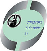
Let’s start the critique with the Elections Department (ELD)’s logo since the ELD is tasked with the gargantuan responsibility of rolling out the national polls. The ELD, like the political parties, probably does not register on most of our radar on a day-to-day basis, so it was certainly a surprise to see how dismal its logo looked. As a department under the Prime Minister’s Office[1], I would have assumed that they would have a decent budget for a branding exercise or that the approving personnel would have been better advised about how it looked. The logo’s description[2] is a mouthful, i.e. full of aspiring statements but fell terribly short on delivery in its actual visual representation. Either that or someone had utterly failed to refer to this as his/her design brief and got away with it.
The ELD’s logo ticked all the boxes for what NOT to do in a logo design. Even for the untrained eye, it reminds one of Powerpoint clipart and tonal effects that is readily accomplished by any of today’s primary school pupil. The semicircle ribbons in tonal grey is an antithesis of what constitutes “dynamic & innovative” and I am not sure how leaving 2 small gaps portrays the ELD’s “readiness to accept new and innovative ideas” either. While I have no issues with the common reference to white when relating to “the integrity of the election process”, the writeup about what the other colours are supposed to mean really takes a lot more convincing than a primary school composition.
The “Singapore Elections 21” italics typography is also too meek to have any considerable impact and they could be better off as bold regular san serif outside of the ellipse. Perhaps a clue to this thoroughly bad job of a logo lies with the “21” since is it’s official line seems to acknowledge that it is still advancing “to modernise its electoral services using 21st century technology”. What really takes the cake is the phrase “myriad of colours”, which must be quite a prank since that got me wondering if my monitor was going. Its saving grace is perhaps the retention of the vintage ELD, now relegated in the centre left of the logo, and they should consider rebooting just that element in their future rebranding exercise.
Table 1: A comparison of ELD’s logo with 3 other election commissions/departments from India, South Korea and Sweden. The 3 were chosen for their contemporary designs which the ELD may be aspiring to create in their logo:
Singapore Elections Department |
Elections Commission of India |
|---|---|

South Korea National Election Commission |
Swedish Election Authority |
The Thunderbolt
In ancient Hellenic and Roman religious traditions, the thunderbolt represents Zeus or Jupiter. Heraclitus of Ephesus identified it as a guiding force that steers all things in the world[3] and it seemed apt that an ambitious political party would choose this icon as part of its logo. In fact, the use of lightning / thunderbolt as part of the People’s Action Party logo has been unique in the political landscape in Singapore. Unlike other visual icons such as the star and sun, that are constantly adapted across parties, the lightning/ thunderbolt is solely found in PAP’s logo.
While I could not locate its description on the official PAP website, I did managed to find a secondary source[4] that described the logo’s elements – “The blue circle stands for unity of all races; the Red represents action; the white background signifies purity and integrity.” In an interview with the Straits Times, published on 27 May 1959[5], the late Mr Lee Kuan Yew made no mention of the different symbolisms that made up the logo but instead claimed that the symbol was synonymous with consistency, honesty, firmness and action. Clearly those aspirations had not changed much over the past 56 years. The longevity of the party and its dominance in Singapore politics has entrenched the visual into our subconscious. Not only do we see it on their banner and flyers, they have even been co-opted into PCF-run preschools. I believe that these exposure help to relate to PAP’s logo and that indirectly affects our association with those ethos.
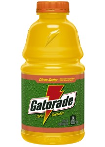
The logo’s choice of red, white, blue are also typical colours in popular Euro-American designs. One may also speculate that recent superhero movies and television series (e.g. Captain America and The Flash) may have provided some currency to the party’s logo since there are similarities in form and colours that the younger audience may relate to. But older folks may relate better to energy drink Gatorade or even automobile manufacturer Opel’s horizontal lightning logo[6]. Visually, the primary red bolt offers a good contrast over the thick primary blue ring. In fact, the blue ring’s median thickness in relation to the bolt’s is almost the same. With a successful brand of politics that the PAP has built over the past decade, one may argue that it would be foolish to fix something that is perfectly running. Should a rebranding exercise occur, perhaps a slight tilt, losing those pointy corners and some tapering on the ring may offer a safe tweak for a post-GE15 PAP.
Table 2: A comparison of PAP’s logo with other popular lightning/thunderbolt inspired logos
| |
|
|
|---|---|---|
 Gatorade Gatorade |
Rings and Stars
A quick scan of the other contesting parties’ logos shows that the National Solidarity Party (NSP), the Singapore Democratic Alliance (SDA) and the Singapore People’s Party (SPP) used rings and stars as the main elements of their design.
Rings and stars polygons are used throughout history in the cultural output of most civilisations. There are 7 types of pointed stars[7] (5-pointed, 6-pointed, 7-pointed, 8-pointed, 9-pointed, 12-pointed and 14-pointed, like the one found on our Malaysian neigbour’s flag) that are used by religious and political groups around the world. For many, living in a post cold-war era, the 5-pointed red star is strongly associated as a communist/socialist emblem but it is actually not always case. In fact, its use can actually be found in all over the world and much earlier in time, such as its use by the Twelfth Army Corps from the Union Army in the American Civil War[8]. Safe to say, a red star is often now imbued with more diverse meaning and used more widely today.
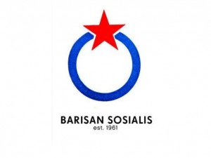
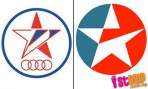
The star and rings of the SDA and SPP also point to the common heritage that the 2 parties share. According to a secondary source, “the emblem seems to have originally belonged to the SPP, which transferred it to the SDA in 2001. The SPP then adopted a related emblem made of four interlaced red rings surmounted by a white red blue star, the whole being inscribed into a blue ring.” [9] The current SPP logo has done away with the four rings and retained only the red star and outer blue ring, while the four rings continue to be featured in SDA’s logo. Perhaps the SDA’s rings still represent the 4 biggest racial groups in Singapore, while “the five points of the star represent democracy, peace, progress, equality and justice, respectively[10]” like its previous iteration but this information was not available on their current party website. The current SPP’s logo too, no longer had to contend with netizens’ charges of it looking like Caltex’s logo[11] unlike the SDA’s logo which echoes Audi’s 4 interlocking rings. Looking further back in history, we can also draw similarities in SPP’s and SDA’s use of the blue ring/s and red 5-pointed star with Barisan Sosialis[12], which was one of the most important political parties during the formative years in our nation building.
The NSP’s logo portrays an 8-sided red star with a white ring inscribed within. It is understood that the party recently adopted orange for their jersey as “a sign of vitality and rebirth” and their party’s newsletter went by the new name North Star[13]. Again, without a description of their logo on the party site, one can only guess that it may be a symbol of the North Star. The North Star or Pole Star was used a guide for early travellers. People could sail the seas and cross the trackless deserts without getting lost. When slavery existed in the United States, slaves used the North Star as their guide to the free states and Canada.[14] Hence one may read that NSP aspires to be a guiding light for their electorate but perhaps it may better serve as a beacon to help it wade through its existing political quagmire, after loosing its high profile members before the current election. NSP’s iteration of the North Star is reminiscent of Alliance Party Singapura (APS)’s logo back in the 60s, though there are little else in common between the present NSP and the now defunct APS.
Given the fluidic nature of candidates from these parties, party stalwarts simply have not had the luxury of seeding and growing their parties effectively. Majority of the electorate would probably not make a distinction for their support of either parties as long as it comes to a 1 on 1 fight with the PAP. With more pressing matters of getting their act together in time for election jousting, perhaps these smaller parties have little or no room for imaginative rebranding and thus opting for more tried and tested elements in their logos. I would suggest that when these parties do have the headspace (& extra coins in their pockets) to do some rebranding, to relook into their core values and distil crucial elements which will distinguish themselves from muddy legacy issues.
Table 3: A comparison between the logos from NSP, SDA and SPP and some of Singapore’s earlier political parties
| National Solidarity Party (NSP) |
Singapore Democratic Alliance (SDA) |
Singapore People’s Party (SPP) |
|---|---|---|

Alliance Party Singapura (APS) [15] |
Barisan Sosialis [16] |
 SPP’s previous logo [17] SPP’s previous logo [17] |
The Sun
The Democratic Progressive Party (DPP) and Reform Party (RP) both with roots from Workers Party (WP) adopt the Sun as their feature in the logo. Neither party had a description on their choice of using the Sun on their respective website, though it may be inferred from RP’s tagline of “A Brighter Future Tomorrow, Today”[18].
DPP’s cookie cutter look is formed by a double (red and white) ray around a yellow centre while RP’s approach was to have a text-based logo which incorporates a tonal Sun as the O in REFORM. Yellow and blue also feature prominently in RP’s publicity material and its candidates’ attire during its campaign. Personally I felt DPP’s design shows a fair bit of flair. The rays’ spikes are arranged alternately and there is still room in future rebranding exercise to have a few more layers of alternating spikes so that it looks like a BP-inspired logo.
RP’s use of orange and blue is refreshing when compared to the mainly primary-coloured logos of other parties. Its logo too offers a degree of visual balance, with the placement of ‘the’ and ‘PARTY’ on either ends of it. However it is puzzling as to why there is an inconsistency in the use of font size, capital lettering and even the need for ‘the’. Imagine how Facebook would have sounded if you have to roll off an additional ‘The’ in front of it, hence RP’s logo is in itself a lesson in K.I.S.S. In fact, RP may also benefit from a more geometric play on the iteration of the Sun’s rays to set itself apart as the reformer of the pack.
Table 4: A comparison between the logos from The Reform Party and Democratic Progressive Party & suggestions as to how they may be tweaked
Reform Party (RP) |
Democratic Progressive Party (DPP) |
|---|---|
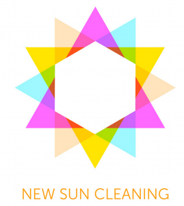 [19] [19] |
The Torch and The Heart
Singfirst and People’s Power Party (PPP) are the babies of the group, being registered in August 2014 and July 2015 respectively.
Singfirst logo according to its founding member Mr Tan Jee Say, “is a stylized adaptation of the simple heart logo that he had used when he was campaigning as a Presidential candidate in the 2011 Presidential elections”[21]. The heartening thing is that they actually bothered putting up a description of what their logo meant with the emphasis of “thinking with their hearts in SingFirst” and red signifying “passion and determination to bring about a fair society with strong families and esteemed people” while white “represents transparency and accountability which are the values all of us in SingFirst firmly believe in.”[22] The logo on the whole is actually refreshing since a stylized heart has never been used before by earlier political parties in Singapore. In fact it is so refreshing that it could very well be Wall’s Ice Cream’s long lost twin. Coincidental similarities in a branding exercise can potentially result in a multi-million IP lawsuit and due diligence must be done, even if you are busy prepping your party for battle. Personally, I like the idea behind the logo, but it seriously needs a makeover if it is to earn some street cred.
PPP’s ideals are said to be adapted from those by Dr Sun Yat Sen[23]. Perhaps it is the beloved leader’s Three Principles of the People that inspired the 3-pointed flame found in PPP but one can also trace the use of the torch in early political parties such as the Liberal Socialist Party (dissolved in 1963) and Labour Party (dissolved in 1961)[24]. Although the flame is well rendered, the proportion of the torch and position of the grip is rather awkwardly off. It will be much better off positioned as a hand trusting forward with the torch, much like UK’s Conservative party’s logo, designed by Saatchi. While not everyone can afford Saatchi’s rates, paying a little more may just get you a logo that not only looks better, but resonates with whom it is intended for.
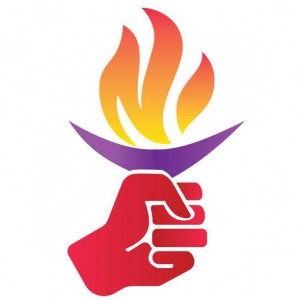
Table 5: A comparison between the logos from People’s Power Party (PPP) and Singfirst, UK’s Conservative Party’s 2004 logo and Singfirst’s long lost twin
Peoples Power Party |
|
|---|---|

UK’s Conservative Party’s 2004 logo |
Wall’s Ice Cream |
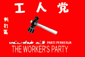
The Arrow and The Hammer
Singapore Democratic Party (SDP) and The Workers Party (WP) are two of the biggest and most influential opposition parties in recent elections. SDP’s had stated that its logo encompasses the circle of unity amongst Singapore’s ethnic groups and an upward-pointing arrow, representing political progress. Its red portrays courage and determination[25] in its political views. It certainly looked modern when launched in 1980, but it has lost some of that shine over the 35 years since its inception. Similarities between it and the beloved Star Fleet Command (Star Trek) logo are obvious but using it as an inspiration for further tweaking may not be the best idea. The circle is still a dated mode of conveying unity (see SPP, SPA, PAP and WP) and given the diverse demographics in Singapore, perhaps more colours and a composite arrow made of different building blocks may just give SDP greater relevance to younger voters.
The Workers’ Party yellow hammer of the people, inscribed within another unity (unity for the working class) ring, has not changed much since 1957 as we can see from the old flag, with the black and white hammer and writings.[26] There were however slight noticeable updates in recent years, as seen in the simplification in the hammer and the emboss applied to both the hammer and the ring. It is a much beloved symbol for its large base of supporters and like PAP’s tweaks to the logo have to be a measured affair. I would certainly do no more than retaining the striking yellow, crop the hammer and do away with the emboss to just update the look for the next fight.
Table 6: A comparison between the logos from Singapore Democratic Party and Workers Party & suggestions as to how they may be tweaked
| Singapore Democratic Party (SDP) |
Workers Party (WP) |
|---|---|

Star Fleet Command (Star Trek) [27]
|
1957 WP Flag |
 [28] [28] |
 [29] [29]
|
Moving forward…till the next elections
When the parties take stock prior to their next campaign, they may want to consider dedicating a wee bit more of time and resources to tweak their existing logos. It should be a priority since given the climate, alternative political packaging do not travel well outside of the gazetted election period. There should be no reason that the branding be constrained by the limitations in design literacy and technology of yesteryear. Printing technology now allows colours to be printed on the cheap and logos need not be spartan 2-colour affairs. The electorate is also much more diverse and educated than before and may be accepting of innovative visual designs. A rebranding exercise, not only in substance but also in style, is often what political parties need to have a curious mind make that ideological commitment.
[1] http://www.eld.gov.sg/about.html
[2] http://www.eld.gov.sg/about_logo.html
[3] http://plato.stanford.edu/entries/heraclitus/
[4] http://www.crwflags.com/fotw/flags/sg%7D.html
[5] http://eresources.nlb.gov.sg/newspapers/Digitised/Article/straitstimes19590527.2.145.aspx
[6] https://en.wikipedia.org/wiki/Opel
[7] https://en.wikipedia.org/wiki/Star_polygons_in_art_and_culture
[8] https://en.wikipedia.org/wiki/XII_Corps_(Union_Army)
[9] http://www.crwflags.com/fotw/flags/sg%7D.html
[10] http://www.crwflags.com/fotw/flags/sg%7D.html
[11] http://singaporeseen.stomp.com.sg/singaporeseen/ge-2011/this-looks-familiar-is-spps-logo-inspired-by-caltex
[12] https://en.wikipedia.org/wiki/Barisan_Sosialis
[13] https://en.wikipedia.org/wiki/National_Solidarity_Party_(Singapore)
[14] http://earthsky.org/brightest-stars/polaris-the-present-day-north-star
[15] http://www.singapore-elections.com/images/aps.jpg
[16] http://mustsharenews.com/operation-cold-store-account/
[17] http://singaporeseen.stomp.com.sg/singaporeseen/ge-2011/this-looks-familiar-is-spps-logo-inspired-by-caltex
[18] http://reform.sg/
[19] http://www.mattcanale.com/new-sun-cleaning-logo/
[20] https://www.bp.com/
[21] https://en.wikipedia.org/wiki/Singaporeans_First
[22] http://singfirst.org/about-our-party-logo/
[23] http://www.singapore-elections.com/political-parties/ppp.html
[24] http://www.singapore-elections.com/political-parties.html
[25] https://en.wikipedia.org/wiki/Singapore_Democratic_Party
[26] http://www.crwflags.com/fotw/flags/sg%7D.html
[27] http://en.memory-alpha.wikia.com/wiki/Starfleet_Command
[28] http://www.canistelarts.com/?p=232
[29] http://www.bunnings.com.au/